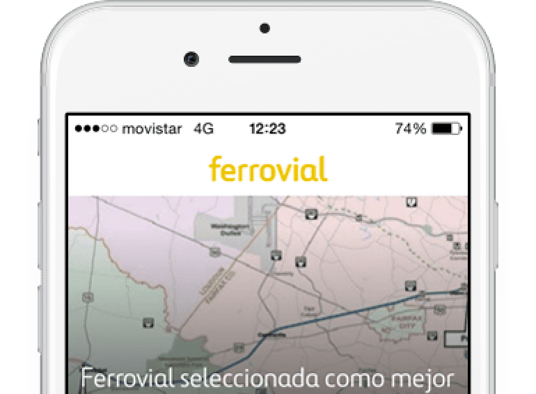
Ferrovial has launched a new blog design. This platform offers an improved user experience with a fresher, more up-to-date style and a place to enjoy articles, videos, and podcasts.
The interactions, colors, and integration of the different content formats are the new platform’s most notable features. The new site not only lets the user read articles but also watch videos, see photo galleries, and enjoy episodes of the Sounds Like Infrastructure and Sonidos de Infraestructuras podcasts.
It also highlights the authors more; in addition to external collaborators, this includes Ferrovial’s employees. The various topics of the content published have been brought to the fore, as well. This move improves the content’s usability and accessibility through the menu and search engine.
The new space was designed specifically with mobile devices in mind since more than 60% of the Ferrovial Blog’s users visit the site on their cellphones.
Content strategy based on brand journalism
Since 2015, the Ferrovial Blog’s content strategy has been based on brand journalism. This means that the company’s stories and related topics are reported with a fresh perspective: they’re narrated by those involved.
In recent years, this strategy has been recognized by different international organizations: it was named Best Blog in PR Daily’s Digital, PR, and Social Media Awards at the PR Daily Awards or PR News Digital Awards, as well as receiving Best Blog Article at the Content Marketing Awards for “How Would We Build the Death Star Today?”


